Introduction: Why Most Business Websites Fail
Let’s be honest: the vast majority of business websites are failing. They exist as passive, digital brochures, floating in the vast ocean of the internet, waiting for someone to stumble upon them. Business owners invest significant time and money into a new website design, only to find that it generates no leads, no sales, and no real return on investment. Why does this happen so often?
The answer lies in a fundamental misunderstanding of the purpose of a modern website. The problem is that most businesses approach their website design as a purely aesthetic exercise. They focus on brand colors, fancy animations, and beautiful images. While these elements are important, they are not the goal. A passive website design that only looks good is a failure.
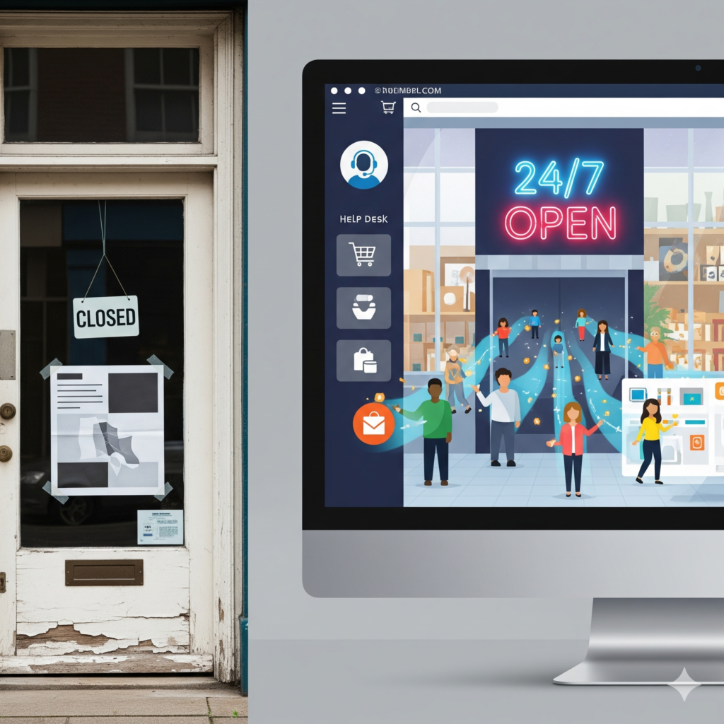
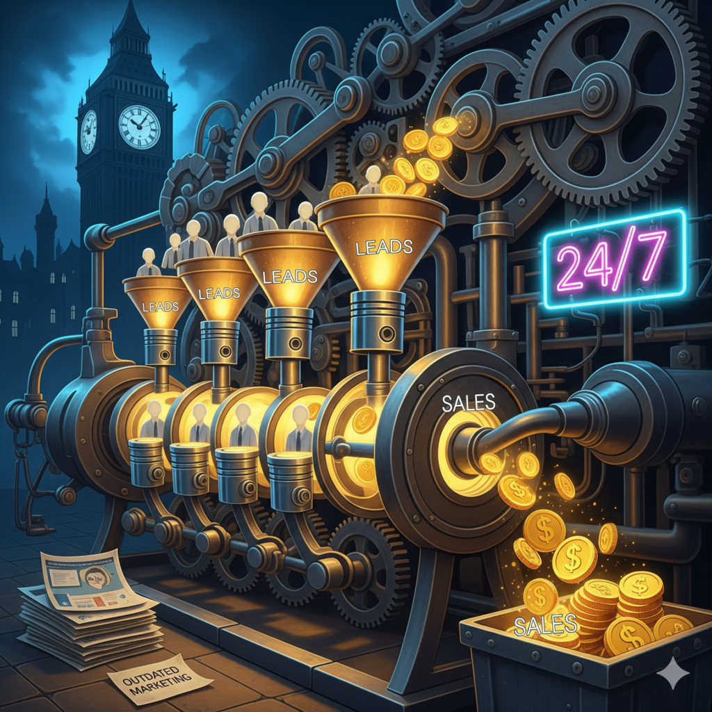
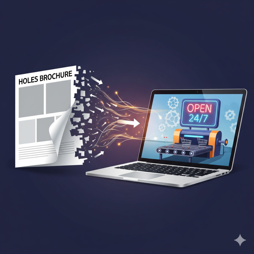
The goal of a modern business website is to be an active, revenue-generating asset—a 24/7 sales machine. This requires a paradigm shift: moving away from a “brochure” mindset to a strategic, conversion-focused approach to website design. In this ultimate guide, we will explore the essential principles and actionable strategies to transform your website design from a static cost center into your company’s most powerful sales tool.
The Paradigm Shift: Rethinking the Purpose of Your Website Design
The first step in creating a website that sells is to change your perspective on what a website is for. Every decision, from layout and color to copy and code, must be made through the lens of conversion.
A brochure website is characterized by its passive nature.It’s informational It lists your services provides contact details, and has an “About Us” page. It’s company-centric: The language is all about we do this and we are great.
It has no clear goal: The visitor is left to wander around with no clear path or next step. This is a classic flaw in a weak website design. The Sales Machine Website Design
A sales machine website is active, persuasive, and built with a singular purpose.
It’s persuasive: It guides the visitor on a journey, addressing their pain points and presenting solutions.It’s customer-centric: The language focuses on the customer’s needs: “You will get this benefit,” “Solve your problem with this.”
It has clear, specific goals: Every page, every section, and every button is designed to encourage a specific action (a conversion). This level of strategic thinking is what defines a successful website design.Ultimately, every element of your website design must justify its existence by contributing to the end goal of converting a visitor into a customer.
The Foundation of Conversion-Focused Understanding Your User
Before you can design a single pixel, you must understand who you are designing for. A beautiful website design that doesn’t resonate with its target audience will fail. Great website design begins not with aesthetics, but with deep empathy.
Create a User Persona: A user persona is a semi-fictional representation of your ideal customer based on market research and real data. Give them a name, a job title, goals, and pain points. What are their biggest challenges? What questions are they asking? Every website design decision should be made with this persona in mind.
Map the User Journey: How does a user find your website? What are they thinking and feeling when they arrive? What information do they need to see to feel confident enough to take the next step? A well-planned user journey is a critical component of a high-converting website design, guiding visitors from awareness to consideration to decision.
Crafting a Compelling Value Proposition: The First 5 Seconds
When a visitor lands on your homepage, you have about five seconds to answer one critical question: “Am I in the right place?” If your website design fails to communicate this instantly, they will hit the back button. This is where your value proposition comes in.It’s a clear, concise statement that explains What benefit you provide. For whom you provide it. Why you are unique.
This is arguably the most important piece of copy on your entire website and must be the hero of your homepage website design. It should be placed “above the fold” (the part of the page visible without scrolling) and supported by a powerful hero image or video. A weak value proposition is a critical failure in website design.
Strategic Call-to-Actions Guiding Users with Purposeful Website
Once you’ve hooked a visitor with your value proposition, you need to tell them what to do next. That’s the job of a Call-to-Action (CTA). CTAs are the signposts of your website.
A weak website design uses generic, passive CTAs like “Learn More” or “Submit.” A powerful, conversion-focused website design uses CTAs that are: Action-Oriented: Start with a verb. “Get Your Free Quote,” “Download the Guide,” “Start Your Free Trial.”
Visually Prominent: Use a contrasting color that makes your primary buttons stand out from the rest of your website design. Strategically Placed: Place CTAs at the end of each logical section of your content, giving users a clear next step after you’ve provided them with value.
The Psychology of Trust: A Cornerstone of Professional Website
People buy from businesses they know, like, and trust. Your website is often the first point of contact, so building credibility is a primary goal of any professional website design. A visitor will not give you their email address or credit card number if your website feels untrustworthy.

Here’s how to build trust with your website design:
Showcase Testimonials and Reviews: Social proof is incredibly powerful. Displaying positive reviews from past customers is one of the fastest ways to build credibility.
Display Trust Badges: Showcasing security seals (like SSL certificates), industry awards, or partner logos can significantly increase a user’s sense of security.
Use High-Quality, Professional Photography: Avoid generic stock photos. Use real photos of your team, your office, and your products. Authentic imagery makes your business feel more tangible and trustworthy.
Provide Clear Contact Information: A prominent phone number, physical address, and contact form show that you are a real, accessible business. A good website design makes it easy for customers to get in touch.
Optimizing for Speed and Mobile Experience
The technical performance of your website is a critical, and often overlooked, aspect of website design. A slow or clunky website will kill your conversion rates.
Speed is a Feature: In today’s fast-paced world, users expect websites to load almost instantly. A delay of just a few seconds can cause a significant percentage of visitors to leave. A performance-optimized website design involves compressing images, using efficient code, and choosing high-quality web hosting.
Mobile-First Website Design: More than half of all web traffic comes from mobile devices. “Mobile-first” means designing the mobile version of your website first, then adapting it for larger screens. This ensures that the experience is seamless for the majority of your users. A poor mobile website design is no longer an option; it’s a guaranteed way to lose business.
Using Content & SEO to Fuel the Machine
A great website design is like a high-performance engine, but that engine needs fuel. That fuel is content. A blog is not just an add-on; it’s an essential tool for attracting visitors and nurturing them through the sales funnel.
By creating valuable content that answers your ideal customers’ questions, you attract them to your site via search engines like Google. This content builds authority and trust. Your website design should then seamlessly guide these readers from a blog post to a relevant service page or lead magnet, turning them from readers into leads. Your content strategy and your website design must work together in harmony.
Deep Dive Section 1: The Anatomy of a High-Converting Landing Page
In our main article, we briefly touched on landing pages. Now, let’s do a deep dive. A landing page is arguably the most critical element of a “sales machine” website. It’s a specialized page created for a single, hyper-focused objective. Mastering landing page website design is essential for any successful marketing campaign. Unlike your homepage, which has many distractions, a landing page’s website design is ruthlessly efficient.
This is the first thing a visitor sees. It must grab their attention and instantly communicate value.
A Powerful, Benefit-Oriented Headline: This isn’t the place to be clever; it’s the place to be clear. It should answer the visitor’s question, “What’s in it for me?”A Supporting Sub-headline: This expands on the headline, providing a little more detail or a secondary benefit.
A Compelling “Hero Shot”: This can be a high-quality image or a short video that shows your product or service in context. The visual component of your landing page website design should evoke emotion and help the visitor visualize the outcome.
Clearly explain what you are offering and, more importantly, what benefits the user will receive. Use a bulleted list to make the key benefits easy to scan. A good website design presents complex information in a simple, digestible format.